Mountains to become the focus of Council's brand
In a move to better reflect the region's identity, Council will gradually decommission the use of its existing logo and begin using an amended version of the well-recognised Visit Scenic Rim logo.
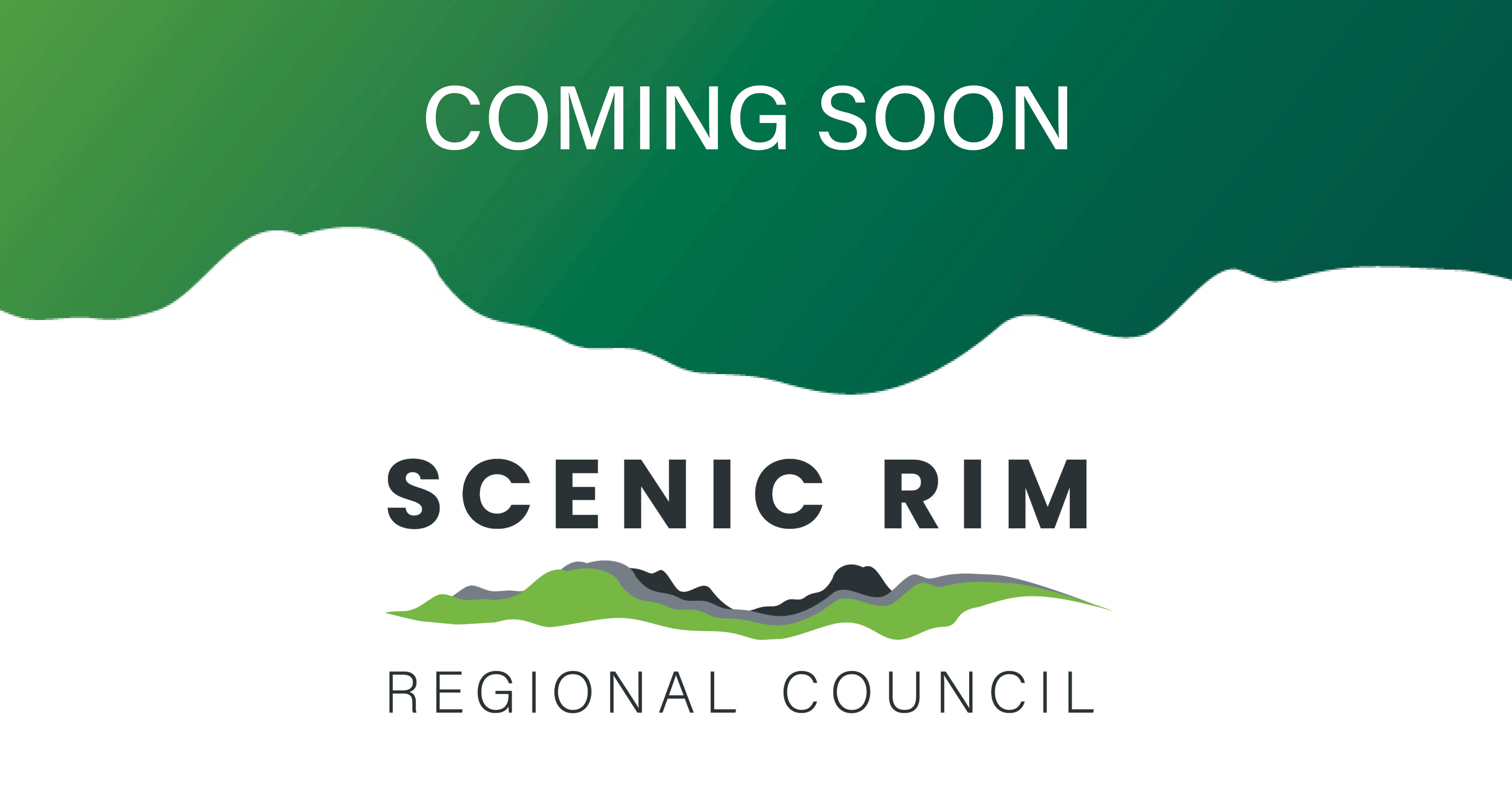
Endorsed at today's Ordinary Meeting the amended version of the Visit Scenic Rim logo, which was developed using in-house expertise, depicts three layers of mountains representing the volcanic mountain ranges the region is so famous for.
Mayor Greg Christensen said that it was time for the Scenic Rim Regional Council to have a brand that is simple and clear and true to the region's identity.
"Back in the 1930s, conservationist, Arthur Groom coined the phrase 'Scenic Rim' to describe the chain of mountains, plateaus and peaks, which was to become the name of the regional council in 2008," he said.
"Using an amended version of the Visit Scenic Rim logo, which depicts a mountain vista better reflects who we are and provides a better sense of place.
"When the Visit Scenic Rim brand was developed, 70 per cent of respondents to a community survey highlighted mountains as a particularly significant, consistent and connecting element across the Scenic Rim region.
"When I speak with our community members, many people think the current Council logo is a swan or a river and comment that it doesn't mean anything to them.
"The existing Council logo and brand was developed as part of amalgamation in 2008 and actually represents three merged Councils, so I think the timing is right for us to no longer be defined by the past."
CEO Jon Gibbons said Council officers would be taking a measured and low cost approach in the transition to the updated logo.
"It's important to us, and to the community, that this change has a limited impact on our operational budget," he said.
"We certainly won't be going out and replacing logos everywhere in the region.
"Many of our assets such as park signs, town entry signs, uniforms, vehicle labels are either replaced due to wear and tear, or as part of an asset lifecycle, so as these items become due for replacement, we will start using the amended mountain version of the logo.
"Our Council Officers are still developing Branding Guidelines and a transition plan to using the amended logo, in between managing their day-to-day deliverables, so the change will be gradual.
"I'm looking forward to reviewing and approving the Branding Guidelines so we can begin the move to this branding that better depicts our region and our vision to be a more modern, contemporary and customer-focused council."